Fine Art Paper vs Poster vs Canvas
A practical comparison of the main print formats for historic maps, with the strengths of each format depending on room, detail, and wall style.
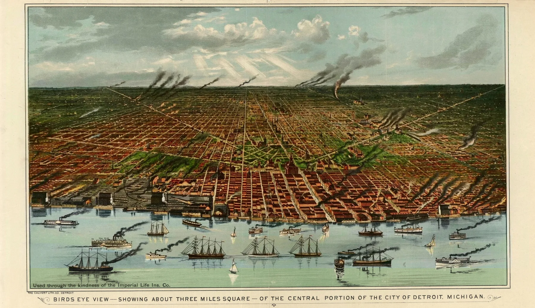
For historic maps, format changes the feeling of the print almost as much as the city. The image may stay the same, but the wall does not. Fine art paper gives a panoramic sheet a quiet, archival presence. Matte poster stock feels lighter and more flexible. Canvas turns the map into an object with more weight and surface on the wall.
Fine art paper tends to suit the archive logic of these prints best. Panoramic maps reward close looking, and a heavier sheet gives linework, labels, and edge detail a calm surface. If what matters is the sense of keeping an old city in view rather than making a loud decorative gesture, fine art paper is often the strongest match.
Matte poster formats make more sense when the room or budget asks for lightness. They still carry the silhouette of the sheet well. They work best when the attachment is to the place itself rather than to every roofline and wharf. If the print is headed for a study wall, hallway, or secondary room, poster stock can be enough without feeling thin.
Canvas works best when the map is meant to behave less like an archival sheet under glass and more like a single wall piece. It gives the city more physical presence. That can suit bold industrial or waterfront compositions, where the map needs to read from several feet away.
None of those formats is better in every room. The right choice depends on what you want the wall to do. If your priority is clarity and archive character, lean toward fine art paper. If your priority is flexibility, a poster format can be enough. If your priority is presence, canvas earns its place. The easiest way to make the call is to settle size first, then compare a few city pages on the archive browse.
Sources and next paths
Compare cities first
Format becomes easier to judge once you know whether the sheet is dense, airy, industrial, or harbor-led.
ThemeIndustrial city maps
A useful theme for seeing how sharp detail behaves on heavier and more tactile print formats.
GuideSee the restoration process
Understanding the file preparation makes the format decision feel less abstract.