How to Choose a Historic City Map Print
A practical guide to choosing a historic city map print by place, era, mood, and room size.
The cleanest way to choose a historic city map print is to decide what kind of attachment you want the wall to carry. Sometimes the answer is biographical, the city where someone was born, studied, married, or left. Sometimes it is atmospheric, a harbor, a boomtown, a dense industrial waterfront, or a place that still looks half built and full of intent.
Era matters almost as much as place. A colonial plan, a Gilded Age port, and a Progressive Era commercial city can belong to the same state and still speak in different registers. If mood matters more than memory, start by era. The archive changes when you move through time instead of geography.
Scale matters as well. A dense panoramic print rewards size. If you want to read rooftops, wharves, and street patterns, a larger format gives the image room. If you want the skyline and overall shape to sit in a hallway, office, or reading corner, a smaller print can hold the city without taking the whole wall.
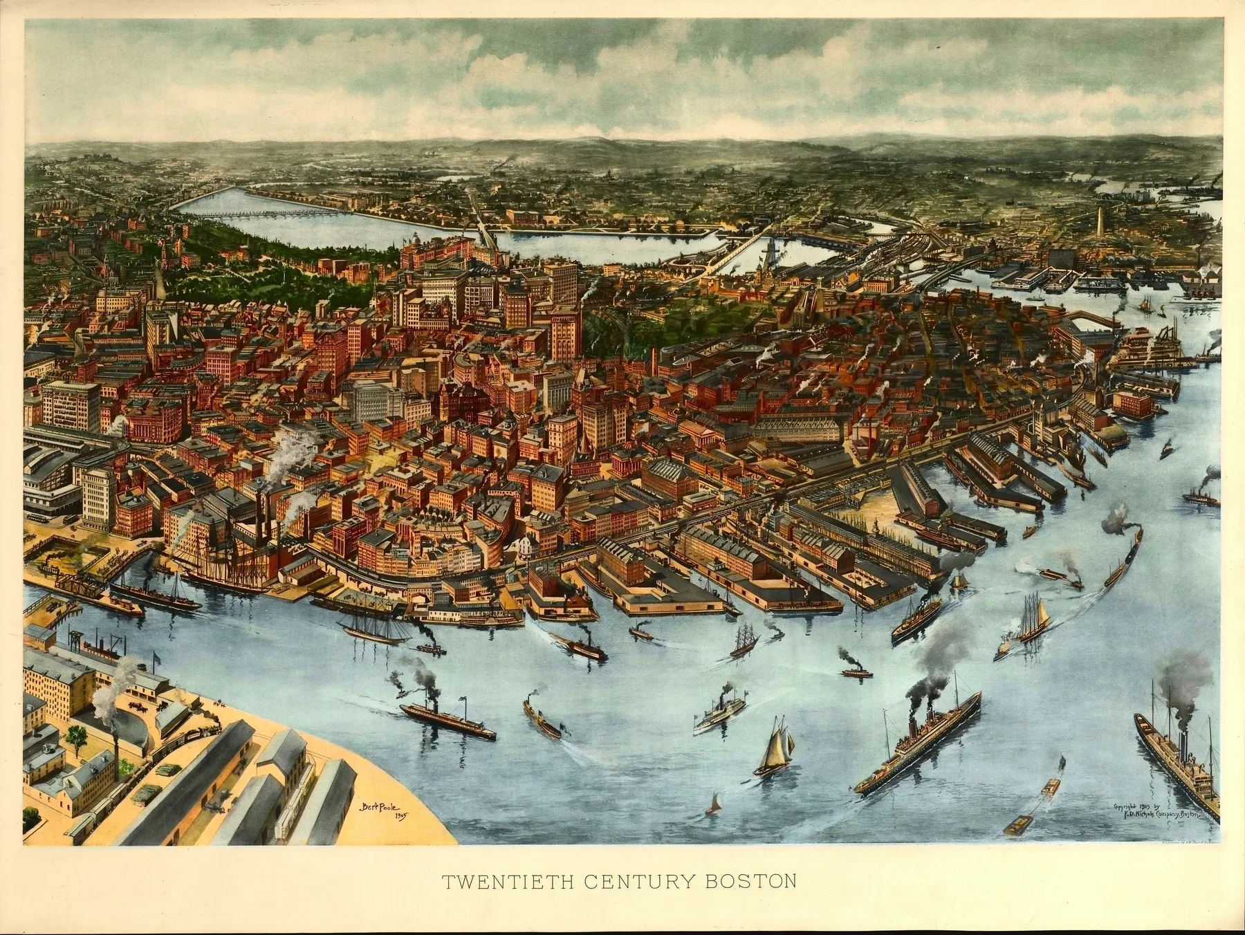
It helps to notice the kind of city on the sheet. Some prints are governed by water and trade. Others turn on factories, rail yards, hills, or civic cores. Boston does not speak the way Leadville or Savannah does. One of the best ways to feel that shift is to compare a few cities side by side on the browse page.
If you already know the place, start with states. If mood or visual habit matters more, start with cartographers or the guides above. The right print tends to announce itself once the city, year, and point of view click together.
Sources and next paths
Compare city pages side by side
The fastest way to feel scale, mood, and density differences is still the main archive browse.
ThemesChoose by visual mood
Start with harbor cities, industrial centers, boomtowns, and other recurring map families.
StatesChoose by place
If memory or biography matters most, move through the archive by geography first.